Introduction to Composition in Photography
So far you have looked at various settings on your camera to help you create the type of photo you are envisioning. This tutorial will help you think about what is actually included in the frame of your photo.
A photo is made up from a number of elements and some might not be apparent to a casual viewer. When looking at a photo:
First consider:
What is the subject?
Is it in focus?
Is the photo properly exposed?
Then think about:
Does it tell a story?
Does it provoke an emotional response?
The first thing to look at is the main subject. Is the subject clearly the focal point in the photo? If not, then the composition is likely to blame. Is it in focus? Most modern cameras are auto-focusing, so this isn’t as much of a concern as it used to be. Exposure is also calculated by cameras these days to give good exposure across a wide range of lighting situations.
If you’re not concerned with focus or exposure, you can look deeper into the subject and figure out how to tell a story and try to capture the ‘feeling’ of your subject.
Ten different photographers can shoot the same subject and come up with ten different images. Portrait or landscape, it’s up to the photographer to pick out what is shown in the image. Composition is what will separate these ten photos.
The great thing about composition is that there are some rules a photographer can follow. The next best thing is that rules can be broken to great effect. With that said, it’s wise to know the rules before breaking them.
Cropping your Image
Before I get any further, I just want to say that your process of cropping begins as soon as you put the camera to your eye. You have the whole world to shoot, but you instantly crop out most of it to concentrate on a tiny area of it. This is what makes photography special. It’s what you do with with your personal, aesthetic decisions that will make or break your photography.
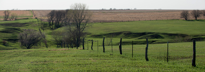
Here are two photos of a landscape. This is a field in Kansas with a fence. Does one image look more interesting than the other?
The first image shows the field, and provides a nice overall view of the scene. It flows from the front with the tire marks in the grass down into the gulley and the contrasting color of the far field provides more background depth.
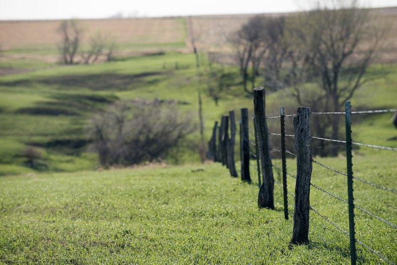
The second image is taken from almost the same spot, but closer to the fence. It was also taken with a telephoto lens. You can tell this because there is less of the fields showing in the foreground.
The second is more dynamic as it limits the focus to the fence (in fact, just a couple of fence posts). The background is still in focus enough to show that it is a field with trees. The fence is used as a compositional tool to draw the viewer’s eye into the photo and guide them down the fence into the field. You might not be able to physically walk down this fence, but your eye can travel down it quite easily.
Looking back at the top photo, the tire marks on the grass can be used to guide the eye into the scene, but they are too light be effective. With any image your eye is drawn to the lightest or darkest spot(s). In the first image, the fence is darker and makes a stronger impression to your eye. In fact, the bottom half of this image is really not needed as it does nothing to help the composition.
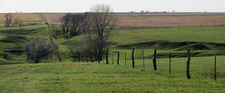
This image hasn’t been changed other than being cropped off the bottom and a little off the top. Sometimes a crop is all that is needed to help an image. It looks a little more interesting now due to the unusual proportions.
Note how the two trees on the right side help balance the image by giving your eye something to look at over there.
If I crop the photo again (below), you can see below how the image looks ‘heavy’ on the left side. Your eye will look down the fence and then stay lost in the trees. A good composition will lead your eye all over the image (and not lead you out).
Below is a simple example of how cropping helps an image. The first image is how it was shot in the camera.
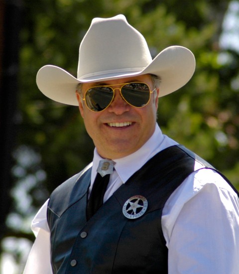
It’s obvious what the subject is here in this photo, but there is a lot of background that distracts from the image. A simple crop makes this a much more interesting image. In this case, the background does not add to the image. It does not tell us anything about the subject, so cropping it out will not seriously affect the photo.
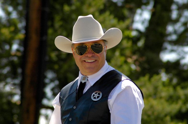
The image below shows how a simple cropping helps to bring focus to the subject. There is still enough background to see that he is outdoors in a treed area.
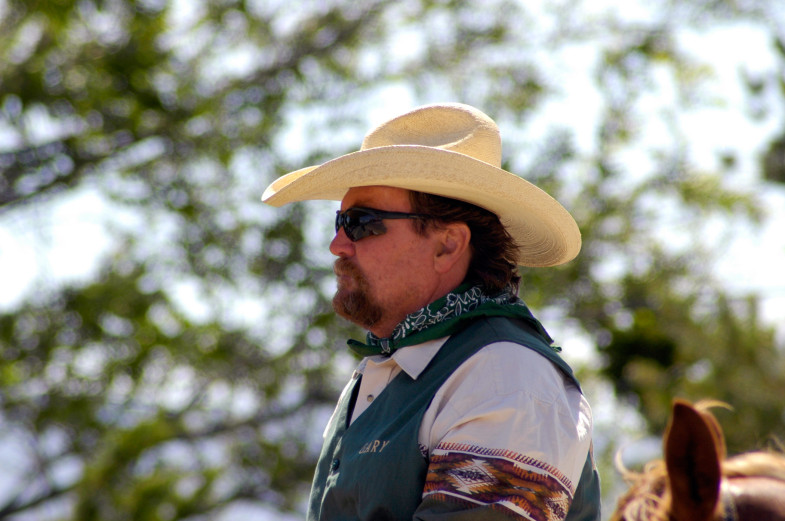
Here’s another photo that needs to be cropped:
Notice a difference between the first portrait and this one? The direction the man is facing is different. I could take the easy way out and just put him in the middle like I did the first one.
Or I could take a moment and think about composition.
The second image looks more interesting because there is space in front of the man’s face. It makes the brain think that he has room to move forward. This in turn can make our brain ask, “What does he see?” “Where is he going?”
Allow Space in Front of Your Subject
A general rule of composition (your first one!) is the give the subject space in front of them to ‘move’ or ‘view’. Don’t cram them in. This applies especially to moving subjects.
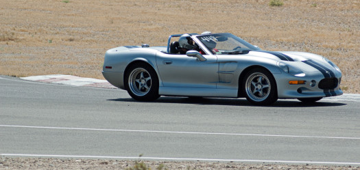
Looking at this image (above) shows what a bad composition can do.
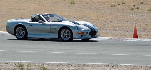
Here’s another example below that shows how the leading space in front of a subject implies movement.
Without the space in front of the subject, the viewer’s eye will naturally follow to the front of the car and then leave the frame. There is a lot of wasted space behind the car which adds nothing to the image. In a case like this when you take a photo and didn’t leave room, it’s good to crop out the space behind the subject to help the composition.
The first image is like reading the end of the story – there’s nothing in front of the car, so it loses any dynamic energy that might be there. The second image allows our mind to envision the car moving forward past the cone and beyond.
So far you’ve seen just a couple of examples of how composition can affect an image. You’ve seen the leading lines of the fence and the open space in front of the cowboy and the race car. These might seem simple or obvious or they might give you clues to why you like some photos better than others.
The Rule of Thirds
One of the most commonly used rules of composition in photography is the aptly named ‘Rule of Thirds’. When you are first starting to consider composition in your images, this is a great place to start (and even seasoned professionals will still use this rule). What this rule means is that you can divide the scene into thirds and place your subject(s) along those implied lines.
Here is a photo that uses this rule:
Of course the thirds are a guideline and you usually won’t be exactly on the ‘thirds’, but in many cases you can be very close. Here’s the same image divided into thirds:
Notice how the left side of the deer lines up along one third. The back of the deer is along another. The bottom strand of the fence is on the bottom third (the top strand near the top third) and the brush on the right ends roughly at the left third.
This rule is a quick and easy way to compose and balance out a photo. Many cameras will even have a rule of thirds grid built into the viewfinder. Even without the visual assistance, it’s easy to look at a scene and compose in this style. Remember that not every element in your photo needs to be set on this ‘third grid’.
If the horizon was higher on this image, it would likely compete with the cross in the composition. This example shows how using a simple rule can create a dynamic image (even if that rule is slightly broken).
Leading Lines
Another common composition tool is to use leading lines to guide the viewer into the image. You saw this used at the beginning of the document with the fence in the pasture.
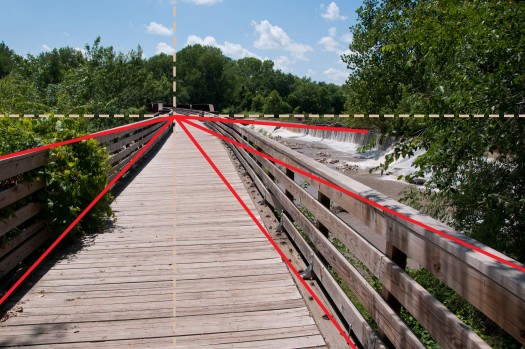
Here’s another example to show how this works.
This is a fairly obvious example, but you can see how your eye can’t help but look down the path. You’ll see lines on the bridge, the railing and the dam in the background all curving around and leading to a single point (which coincides nicely with the rule of thirds. Also note that the lines do not lead you out of the images edges either.
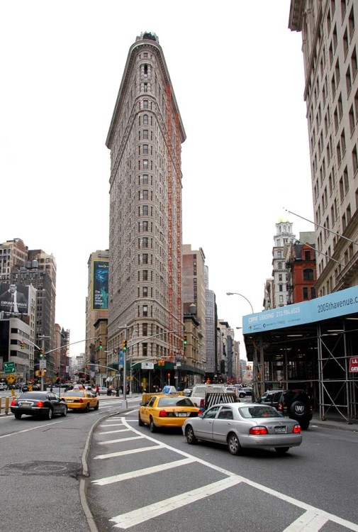
Leading lines can be used to either lead your viewer’s eye to a vanishing point in the image or to your main subject.
This isn’t the best composition, but it shows great use of how leading lines can take the viewer straight to the subject. The white lines on the road and the tall building all lead to the same place. The distracting part of the composition is the blue sign on the right, which can lead the eye back out as it is the most noticeable color.
Symmetrical images
There are sometimes you’ll see a scene and it just looks ‘perfect’. In some cases these naturally occurring scenes are symmetrical in their appearance. In these images, you need to pay close attention to make sure that your composition is perfect (or allow yourself room to crop perfectly).
A symmetrical image that isn’t ‘quite’ symmetrical will fail as a composition as the viewer’s eye will quickly notice that something is off.
The next image so how symmetry and the rule of thirds can work together.
This image is balanced, uses leading lines and the horizon is on the bottom third of the image.
Now look at the same scene with the pier off center and the horizon slightly tilted.
One image relaxes the eye, while other makes it work hard to balance the image.
Symmetrical images do not need to be ‘identical’ from side to side (or top to bottom), they just need to convey the impression of balance.
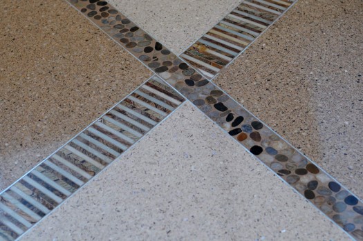
While you’re looking at this image, think about where your eye is drawn to. Naturally the eye will look for the lightest part of the image. In this example, it’s the large triangle at the bottom. the leading lines will take your eye up to the intersection of the two crossing lines. So there are a few compositional elements involved in this simple image. And yes, the intersection occurs at the top third of the image.
Foreground Objects
When shooting landscapes, it is very common to add a foreground object into your scene. This is similar to the first photos of the pasture, where the fence became part of the composition and was in focus. Here is another example that shows how this can be used improve the interest in your image.
Look at the above photo taken in the middle of the Mojave desert.
It’s a nice scene, but there are no lines to lead the eye into the scene, the rule of thirds isn’t used, it’s not symmetrical in any way so the scene doesn’t have much to offer other than being a clear snapshot of the desert.
Here’s a photo taken in the same area, but with a strong foreground object to add interest.
The photo now gives the viewer a reason to look further into the scene. There is an interesting plant in the foreground, another similar plant a little further back, then more brush and vegetation and finally a mountain in the background. It’s not a perfect composition, but it’s much better than the previous desert scene. One thing I don’t like about this image is the leaves from another plant coming in from the right. They are ‘disembodied’ and just don’t belong in the scene.
Here’s another photo from the same area. Have a look at it and see what works towards good composition and what doesn’t. Look for some of the rules that have already been discussed and also consider what your eye tells you.
Is it pleasant to look at? It is balanced? Does your eye go into the image with purpose or just wander around and leave?
Foreground objects can be hard to find in some cases, so it takes a little practice to find them. Keep in mind that if the chosen object is considerably lighter or darker than the rest of the scene, it may be overpowering. Don’t be afraid to try different angles as well.
People can also make great foreground ‘objects’. Try not to place them smack dab in the middle, but remember the rule of thirds as a great starting point to composing your image. They also don’t have to be looking straight at the camera, try some shots as they look out to the scenery, or are walking along a path. If they are walking, it’s a great idea to catch them in mid-step to convey motion.
And sometimes you’ll want to avoid the foreground object altogether – in this case, the car:
Balancing Elements
In the previous paragraph I asked, “Is it balanced?” It was almost a trick question since we haven’t looked this concept yet, but it’s also something that can be naturally apparent if it’s there, and painfully obvious if it isn’t.
Have a look at the next two images and see if one appears more balanced than the other.
Sometimes just a small, simple element can help to balance out a photo. This example uses light and dark against the neutral background and in the left photo the eye will bounce back and forth as it tries to decide what is the actual subject. On the right photo, the eye looks at the dark area and stays there (making the image less dynamic).
Here is another photo that uses balance to create a composition.
The left and right side are almost equal in visual ‘weight’. The two elements are also very different in tone, color and historical significance. They are related in that they both consist of straight lines. They both contain near equal amounts of light and dark areas. The glossy lighter ends of the vigas on the left might throw the balance a little off to that side, also they are in sharper focus which the eye likes to see. The right side has some strong lines that lead the eye to the cross.
Sometimes you can have small objects work together to balance a large one.
Although the large building in the background gives a lot of weight to the top right of the composition, the lighter water and kayaks helps to balance things out. Without the kayaks, the photo becomes rather bland. Some times you have to wait for your composition to come together.
Point of view
Another key to composition is the viewpoint that you use to take the photo. It’s easy to fall into the habit of taking all of our photos at eye level. Sometimes you need to look up, look down, look at an angle or just find a different perspective or viewpoint from what everyone else uses. This is especially true when you photograph a common subject and want your image to stand out a little.
Here’s a photo taken from a higher level to show the lobby of the Natural History Museum. This viewpoint combined with a slow shutter speed gives a unique look at a common tourist spot.
Look up, look down, get down on the floor if you have to. You’ll never know what you’ll see otherwise.
Striking images can be all around you with just a little creative perspective.
Using a wide angle lens can help accentuate some of these viewpoints, so if you have zoom lens available to you, consider going wide to enhance your viewpoint.
Digital imaging allows us to experiment, so try a few different angles with your subjects. You might not know what works until you are reviewing your images at home.
Remember that a unique subject won’t make a photo stand out just for that one reason, you will still want to pay attention to the regular rules of composition. Make sure the image is balanced and interesting to the eye.
Framing
I’ve mentioned earlier that one goal of composition in photography is to lead the viewer into and around your photo – but not out of the image. One way to achieve this is by framing your photo with borders created from elements in the scene.
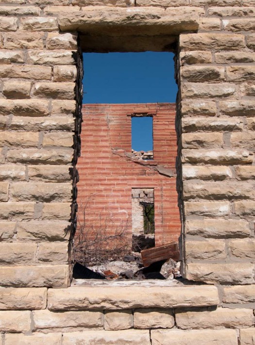
Here’s an extreme example how it can work:
Here the image is somewhat symmetrical and the darker area in the middle leads your eye into the composition. The lighter border of limestone bricks does the job of keeping you focused on the middle area.
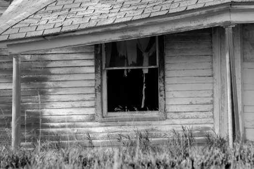
Here’s a more subtle example that uses framing to create borders on four sides of the image. The posts on the left and right along with the fascia at the top work together with the grass at the bottom to frame the side of the house and make the eye focus on the dark window.
There is no use of the rule of thirds, leading lines or a unique vantage point, yet this image keeps the eye interested by attracting it to the dark area and letting the viewer find the curtains have turned to rags, the paint is peeling and the house has seen better days.
It can take a while to train your eye to look for framing in a composition, and in some cases you might not see it until you look at your photos on the computer. Always remember that you can crop and tweak your image for better composition after the fact (but it’s better to get it right the first time).
Cropping People
Here’s a short and simple rule that is easy to learn doesn’t take much practice at all. When you are shooting people, try not to cut them off at a joint (elbow, knee, neck, etc). This leads to people having an uncomfortable feeling while looking at your photos. They may not know what’s wrong, but it’s better to crop in between the joints (thigh, shin, torso, etc).
Here’s a sample of how this works:
The middle photo shows the subject cropped at the knee while the right photo is cropped at the shin.
Backgrounds (and Distractions)
Nothing can ruin a photo like distracting objects in the background. Everyone has taken a photo of a favorite relative with “a tree growing out of their head” at some point. That’s an obvious example that comes to mind, but in many cases, it is more subtle and just be a matter of timing or repositioning your camera.
Two photos taken twelve seconds apart. The distractions in the photo on the left were gone and the image is much more pleasing.
The next photo features one of my personal pet peeves. When I look at my photos, I’m always searching for the leaves and branches and other objects that just don’t belong in the image. To me these ‘disembodied’ items have to go.
It’s a subtle distraction, but still one that takes away from the overall image. I could either crop the image in from the right or use an editing program to ‘clone’ the leaves out of the image.
Patterns
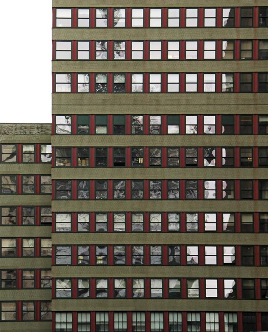
Finding repetition of patterns can lead to some interesting composition choices. It’s also a good idea to look for the ‘break’ in the pattern to add interest to the image.
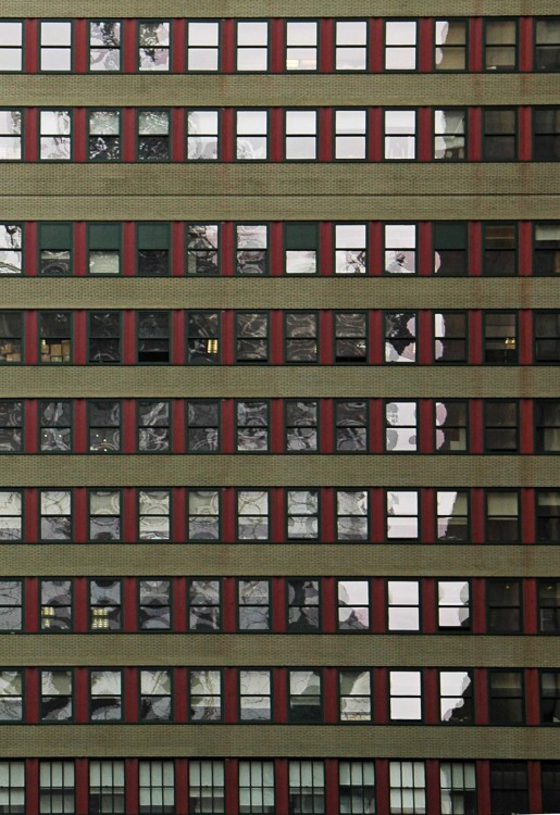
In this photo, the New York building repeats the same window pattern for many stories. I’ve included the second building to add some interest, but in the following image, I’ve cropped it out. Which do you prefer?
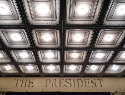
Here’s another example where a pattern also works as leading lines.
This is also a nearly symmetrical image, but the text and the column tops (at the very bottom) are not quite equal.
Of course, the whole image doesn’t have to consist of a repeating pattern, you can use the patterns in other ways. Here’s an example that shows a pattern used as leading lines.
Then there is another pattern in the background. This composition doesn’t quite fit the rule of thirds, but it is close.
Get Closer (and Fill the Frame)
A common approach in photography is to try to get ‘everything’ in the photo. This might work in some cases, but in many it will leave the viewer wanting to see more detail.
Above is a beach scene that shows a lot of the coast line and gives you a good idea of what the area looks like.
It’s a decent image with the sea, sand, some windsurfers and beach houses. You can even see the palm trees. If I look at it critically, the right half of the image doesn’t tell me anything that I can’t see in the left half. It’s nice to have the extra space for the windsurfers to move in to, but is it really necessary to show all of that water?
This is where you have to be your own worst critic and ask yourself if cropping out most of the image will improve your composition.
Here’s the cropped version:
It’s much more efficient at showing the scenery while also making the image a little more dynamic by making the windsurfers a larger percentage of the frame.
In many cases you can’t move in to get closer or use your lens to zoom in, but you can always try cropping to improve your photo’s composition.
Summary
This has been a short lesson about composition in photography. I have read several books that cover this topic in much more depth and there are dozens of great books out there that will give you more ideas and examples.
For an introduction, I’ve tried to show some of the basic rules that I apply to my photography. Use these as a starting point in your own images and try to expand on them, combine them, ignore them – but ultimately, be aware of them as you look through the viewfinder.
To review, here are the concepts discussed in this lesson:
- Allow Space in Front of a Moving Subject
- Rule of Thirds
- Leading Lines
- Symmetrical Images
- Foreground Objects
- Balancing Elements
- Point of View
- Framing
- Backgrounds (and Distractions)
- Patterns
- Get Closer
Back in the days when we shot film, we limited ourselves to how many photos we would take. It was fun to experiment, but costly. These days we have a near infinite number of photos we can take when we are out shooting.
Use this to your advantage and shoot and shoot and shoot again. One tip I’ve offered to other photographers before is “If it’s worth taking a photo of, it’s worth taking three photos of”. This quick tip reminds you that you shouldn’t be happy with the first shot you take and move on. Try at least three different shots of the same subject and see if you can improve on each one.
Another tip is “There is always something to take a photo of”. It’s very easy to get complacent and think that you have shot everything in your home, yard, home town or surrounding area. Force yourself to try to shoot the familiar again with a different outlook. Try different perspectives, different times of day, different lenses (if you have them). Don’t get in a rut.
Strive to get more aware of your surroundings and better photos will follow. Learn to see, rather than look. See the unusual. See the juxtaposed. See the humor.
Finally, the best way to develop a better eye for photography is to look at great photography and try to see what makes a great image so captivating.
If you enjoyed this post, please leave a comment below. If you have any questions about this topic or would like to learn more, feel free to email me.
Next Lesson: How to Care for your Gear >>
Resources to Continue Learning:
Books:
Software:
PixBuilder Studio – free editing software (jpg only): http://www.wnsoft.com/pixbuilder/
Photoshop & Lightroom CC – Adobe Creative Cloud Photography plan (Photoshop CC Lightroom)
Photoshop Elements – Adobe Photoshop Elements 2022
Corel Paintshop Pro – Corel PaintShop Pro 2022 | Photo Editing & Graphic Design Software [PC Disc]


