Using Color in Photoshop
Introduction
Previous tutorials have shown how to select, move, crop and otherwise work on the image without really changing anything. Things are about to change. This tutorial will deal with color in Photoshop: selecting it and drawing with it. If you are working with any kind of graphic design, you’ll need to know to how to quickly and accurately work with the colors you want. This tutorial will also demonstrate the brush tool and the pencil tool. For more info, check out the video at the bottom of the page.
Selecting the foreground and background colors
Towards the bottom of the toolbar you’ll find 2 squares, one over lapping the other. The one on top is the foreground color (red in this example), the one on the bottom (yellow) is the background color. You might remember seeing a background color when you selected an area and then deleted it. That’s what the background color is for – providing a background. The foreground color is the active color that you will use when your using the brush, pencil and other tools. Below is an image of the toolbar with a red foreground and blue background.

You’ll also see the brush flyout – we’ll get to that in a bit. Do you see the the double sided arrow between the red and the yellow? Picking on that allows you to instantly swap the 2 colors, or use “Shift + X” will also swap the colors.
Selecting a Color in Photoshop using the Picker & Slider
Selecting a color can be as easy as picking on one of the squares and then picking a color. But there are other options as well. Here’s what the Color Picker looks like.

To select a color in Photoshop using the picker, you can move the slider up and down to get in the color spectrum you want, then fine tune the selection with the picker. To the right of the slider, you get to see how the new color compares to the current selection. In the bottom right area there other a few options for manually inputting the values depending upon the use of the image, or what information you have.
For example if you are working on images for a website, you might have to match the background of the page. In HTML (website code language) colors are written as a six digit unit (hexadecimal). So you might have a background color on your page that is #FF0000, and you can match it exactly by entering the number at the bottom next to the # sign. Below is a table that shows how the different color modes are generally used.
| Color Mode | Description |
| HSB | Hue, Saturation and Balance – allowing you to fine tune colors by percentage. |
| LAB | Luminosity (0>100), A channel (-127>128) colors from green to red, B channel (colors from blue to yellow). Device independent color that should print or display or print the same on any monitor or printer. |
| RGB | Red, Green, Blue – this is how monitors show color – RGB is good for video display. |
| CMYK | Cyan, Magenta, Yellow, Black – this is a standard for printing. |
| # | Web color – a six digit hexadecimal code used for HTML. This is based on the RGB system where the first 2 digits are for Red (00>FF), then G uses the next 2, and B uses the last 2. Example: #FF0000 = Red. |
As you can see, there are different color modes for different uses. You’ll also notice that if you use the color picker, all the values are entered automatically so that you can use those values elsewhere.
In most cases these days, you’ll be asked to provide an image in either RGB or CMYK. This is can be set by using the Menu Bar Image > Mode dropdown menu. This can be set when you start an image or at any time you are working on it. This defines how the data in the electronic file is saved.
Play around with the color picker by using a combination of the picker, slider and inserting values. Later tutorials will deal with these in more detail as needed. Select a new foreground and background color and press OK.
Brush Tool
The brush tool is used to ‘brush’ color on to the image – so I guess it is aptly named. The brush tool also has a number of options that can be set in the option bar.

The two most important settings to make are the Size (Diameter) and the Hardness (Edge Fuzziness: 0% = softest / 100% = hardest edge). The can be done by using the presets (as shown above in the red box) or using the sliders for custom settings. You can also change size ‘on the fly’. Use the [ key to make the diameter smaller, and the ] key to make it larger. To change the hardness settings using keys, hold down the Shift+[ key to make the brush softer and Shift+] to make it harder. You can also access the brush size and hardness by right clicking on the image area while the tool is active.
Start a new drawing and make it 900px x 600px and use the brush tool to add color to the canvas. Change the settings using the presets, sliders and keys. These options also work on other tools so get used to using them (you’ll be using them a lot!). Something that works on many tools is to hold the Shift key down while moving the tool to get it to move in a straight constrained line.
Another option for the brush that you’ll use frequently is the Opacity slider. This changes the transparency of the tool. If you want a subtle amount of color, you can lower the setting. A setting of 100 makes the Brush opaque. You can also set the opacity by pressing the number keys 1 > 0. 1 will give a lower opacity, 0 will give 100%. this is especially handy when you are trying to smoothly blend 2 images or paint something out.
You’ve probably seen the mode droplist. This tutorial won’t explain them, but some of the options will be used in later tutorials. For now, just keep playing around with them and make some color! If you have a look at the bottom of the preset list you’ll see some shapes that can be used with the brush tool. Try them out and see if you can make something like the image below using the brush presets on the right side of your screen and changing colors as needed.

Pencil Tool
The pencil tool works similar to the Brush tool, but has a hard edge. Work with the pencil tool and try the same options you did with the brush tool – note the differences. Note that you can adjust hardness on the Pencil, but it has no effect.
Color Replacement Brush
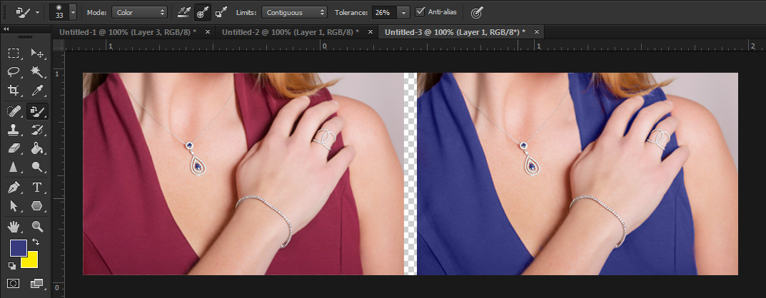
This tool allows you to replace one color with the current foreground color. In the example shown below, the model had a burgundy dress on, but we felt a blue dress to match the stone in the jewelry would look better. I used the colour replacement brush to change the dress (on the right). This takes a bit of practice, but it can be very powerful tool for designers and photographers.
I started by selecting the blue in the stone using the color picker, then start the Color Replacement Brush. Using various sizes, hardness and tolerance I was able to do this fairly quickly. Tolerance is the difference in colors and tones of the area you are brushing over. A tolerance of 1 would only match a single, exact color. As your number goes higher, the tolerance, or variation, is much greater. This allows you to find the right setting to include shadows in the dress (darker shades of burgundy).
In the example above, I have made the circle 1/2 the width and angled it at 45 degrees. You’ll also see some other options that use terms that you should be familiar with such as Tolerance, Anti-Alias and Contiguous. You can also resize the standard brush in the same way through the Brush Palette.
You can activate the brush, pencil or replacement brush at any time by pressing the letter B, and cycle through these tools by pressing Shift+B.
Conclusion
This lesson contains some elements that will be used in later tutorials, and more importantly – actual day-to-day work. If you can not select the right color, or use the tools quickly and easily, you’ll be struggling. I mentioned that the keys can be used to change parameters – this is true with other tools. You’ll need to pick color when creating text and with other tools. Learn these techniques and soar!
Reference
To read a little more about color, visit this page
Reference
To read a little more about color, visit this page